
Doors to Explore
Research & Design/ 2018
Summary
Challenge
Our client came to us with a robust set of data on careers and schools in STEM that was too dry and practical to capture the imagination and attention of high school students.
Context
We needed to figure out how to engage students in discovering new fields without using personality tests or preference questionnaires and utilizing the client's available, data-based content.
Outcome
We leveraged research insights and testing to turn disengaging content into an exciting experience for students to explore their potential futures
Role
Client lead for team of four designers, Research, UX

Problem
Students make one of the most impactful decisions of their lives – choosing a major and college – without having a full scope of their possibilities. Despite offering some of the highest paying jobs and continued growth, STEM employers face constant shortages in qualified workers.
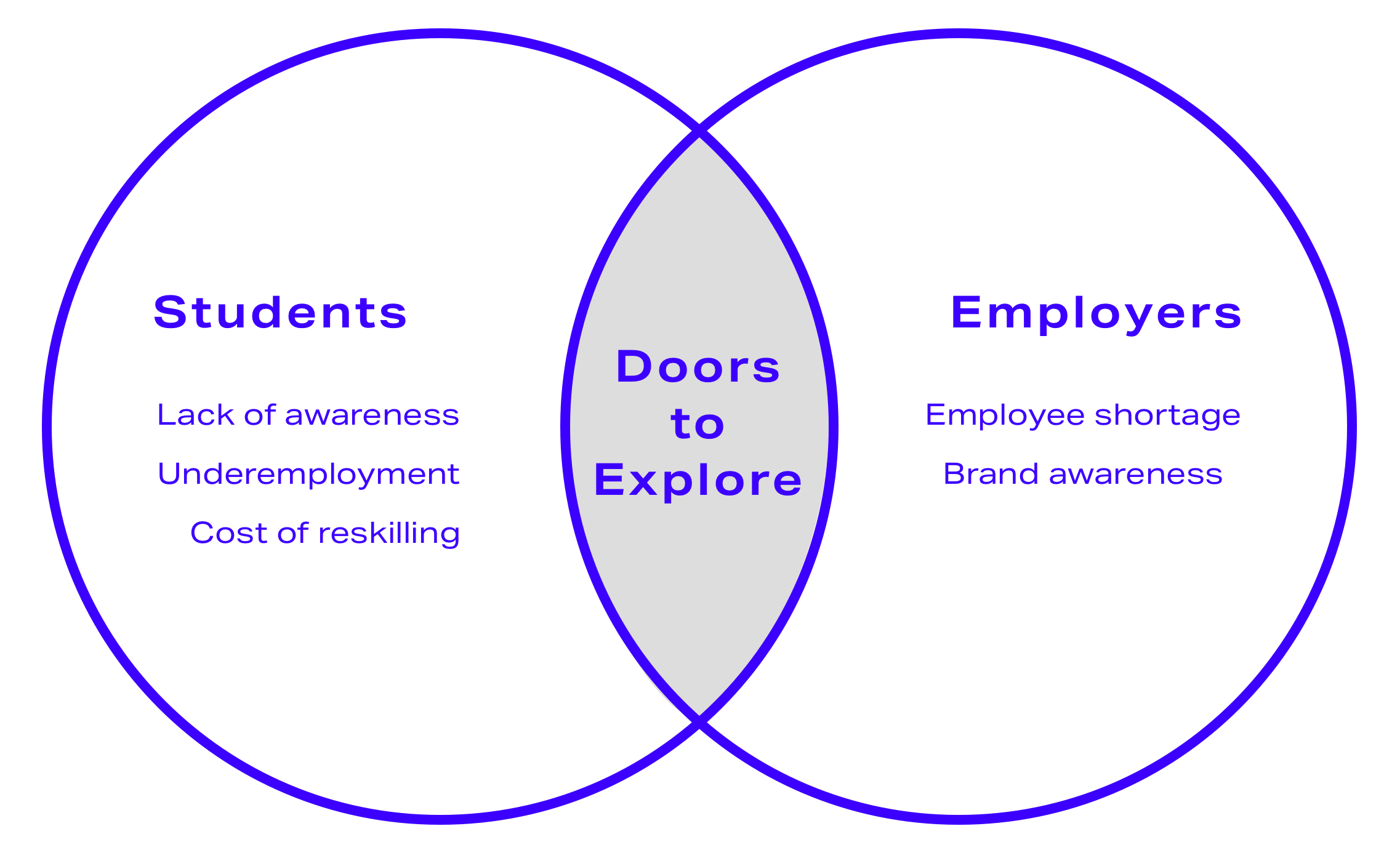
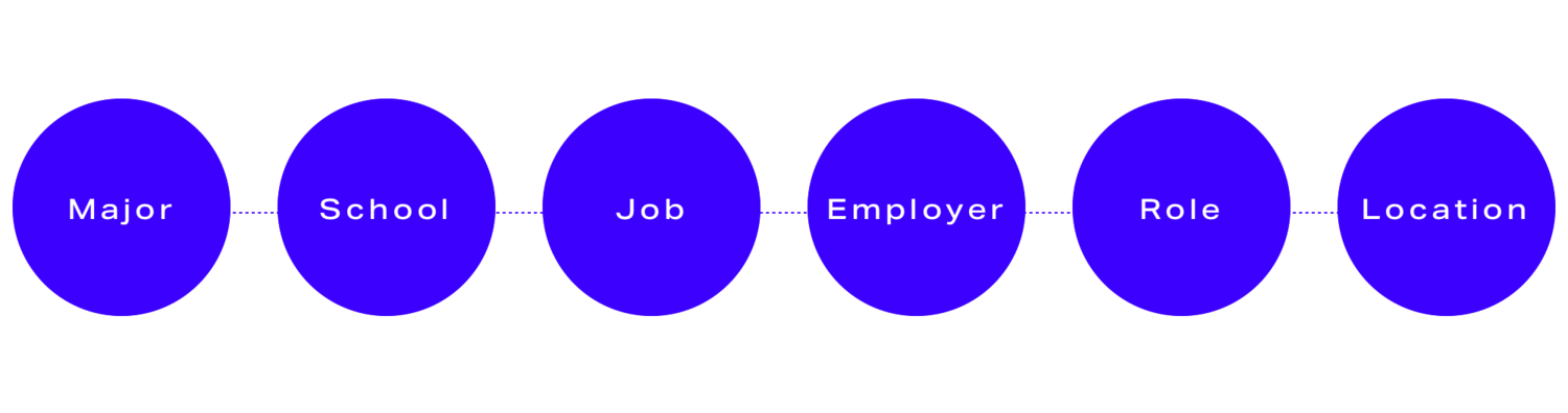
Our client wanted to match students to career paths and potential employers, showing them viable roadmaps to in-demand tech careers by lining up six factors to lock in a career pathway.

School districts would assign the app to students and employers would pay to be featured, with success measured by Awareness and Engagement metrics: Task Completion to quantify connections to employers and options explored, as well as growing daily and monthly active users. Our scope for the first phase was defining the student experience.

Process
Research
We analyzed survey data from 100+ students, conducted interviews with students, STEM workers, and teachers, and analyzed competitors. Competitive research showed our competitors generally lacked either an end-to-end roadmap connecting education to careers or a detailed STEM focus. Comparators provided visual inspiration we’d bring into interaction and UI elements.
We broke our user interviews into two sets: students and STEM workers. We wanted to understand not just how students currently researched and evaluated their options, but also what they could learn from the trajectories of current STEM workers.
Analysis
Our research with students and STEM workers indicated three factors held the most influence over career decisions: people in their lives, natural talent, and personal interests guided their initial decision-making. Hands-on experiences like internships confirmed their direction.

We also identified three major challenges to finding the right STEM career: lack of awareness, how their talents and skills transfer, and making clear connections between their educational background and careers.

From there, we developed our personas: Emily, a high school student just starting to explore her options; and David, a college sophomore who’s just completed his first internship – and is afraid he’s made a mistake that he’s stuck with.


From our research, we knew how much Emily and David valued hearing personal experiences and understanding the day-to-day of various jobs. But when pitching our initial concept that was oriented around these findings, we hit our first constraint: we were limited to the data-based content in the app, which relied on quantitative data like Annual Wage Percentile, school sizes, or simple definitions of fields of study (see the example below).
Time to pivot. How could we engage students, who value personal experience, solely with data?

Ideation
Making Data Delightful
We sat down with the available content to make sense of potential paths and rework our user flows, armed with greater detail on the backend feasibility and connections between different pieces of content.

Making sense of potential paths, armed with greater detail on the backend feasibility and connections between different pieces of content. Click here to view full-sized versions of all flows I created.

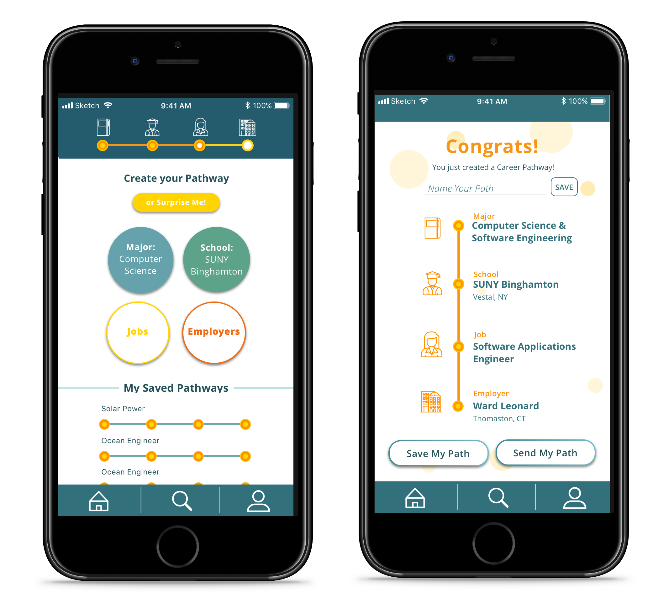
Emily, a high school sophomore, would choose to consciously explore each factor through the app to create her pathway, satisfying her curiosity and excitement.

David, a college freshman, would select his School and Major (which he's already declared), then randomize his results to see viable career options he may not have considered before.
We’d made connections through a series of user flows, but how could we guide and engage users through a dense collection of data-based content?
Bubbles.
To make the progression down career pathways more of a game, we simplified the quantity of information presented at each step and allowed users to openly explore and progress through each step.
From our first round of testing, we saw boredom and confusion moving through the six factors our client had defined. After moving through three to four, testers were visibly uncomfortable and wanted to abandon the process. They also expressed confusion – how did Roles and Jobs differ? Why would Location be separate from Schools or Employers?

1. Our original Home Screen showing all six factors for a viable path.
2. School Detail Screen displaying facts within bubbles.
3. Revised Home Screen: We simplified the quantity of selectable factors from six to four and limited content presentation within bubbles, which overwhelmed users.
4. We incorporated filtering by location within the School and Employer screens, rather than as a separate selectable factor.
We went back to the client and advocated for simplifying the factors, matching the taxonomy and mental models of her audience.
The original 6 factors.

The simplified career pathway.
Solution
A Clear, Visual Pathway
Provides users with a clear end goal and visualization of potential directions, from Major to Employer, making the data and connections between them navigable.
Revamped Presentation of Content
Presents existing data-focused content in an engaging way to improve findability, usability, and friendliness to students.

Improved Usability
Brings information students care about to the forefront, provides guidance, and offers easy ways for users to reach their end goal faster if desired.

A Serious But Fun Visual Identity
Our client expressed the need to strike a balance between fun and serious – previous attempts at branding felt to juvenile for the gravity of the app (choosing one’s future).
We selected a colorful palette and gave each of our four final factors a distinct shade, staying away from primary color schemes typically used in educational apps. Moving away from stock photography, we incorporated tech-focused icons with a bit of personality.


Impact
One of our biggest challenges was trying to help our client, a highly logical and quantitative client, understand the needs of students she was trying to help and move from a perspective of "I know what's best" to see that not all students would think like her.
Our research helped open her eyes to how her data and content approach might need to be revisited in light of her goals. Our suggested interaction design helped save $30,000 in costs to redevelop the app later.